Want to know how to create fun business cards? When I first started blogging, I would tell people about my site and hope they would remember the name of it. This method doesn't work so well. I knew there could be a better way, so I decided it would be a good idea to have cards on hand to make it easier for people to remember how to find me later.
One thing I've learned about bloggers is how helpful they are. I mean this, everything I've learned from how to start my blog, how to take better photos, how to use plug-ins and widgets, all the stuff I knew absolutely nothing about when I started....I've learned through reading other blogs. They are so forthcoming with tips and tricks to help other bloggers succeed. I think that's so amazing. My hope is that this post can help someone else!
I was only familiar with the old standby business cards...you know, rectangular, plain and boring. I ordered some off of a template that were kind of cute, but still pretty boring. I handed them out, but was I super excited about them? No. Here is my very first one...
Also, many of the templates have name, address, phone, etc. I didn't need all that. I later saw an add for MOO on Facebook. I saw that they had cards in fun new shapes and sizes and it intrigued me. I thought to myself, "bloggers are creative and colorful....my cards should be more artistic and fun!" I decided to try the square cards and worked off of one of their templates and added my own picture to one side. Here's how those turned out...definitely more personality than my originals....
When those ran out, I had a better idea. I wanted to be able to hand someone a "blog post" essentially. So I completely designed my own cards, front and back, to have 5 different photos on the back so people could get an idea of what my posts look like....and add variety. I wanted people to WANT to go look at my site. What I have found with these, is people LOVE them. They want one of each! Here's what those look like...
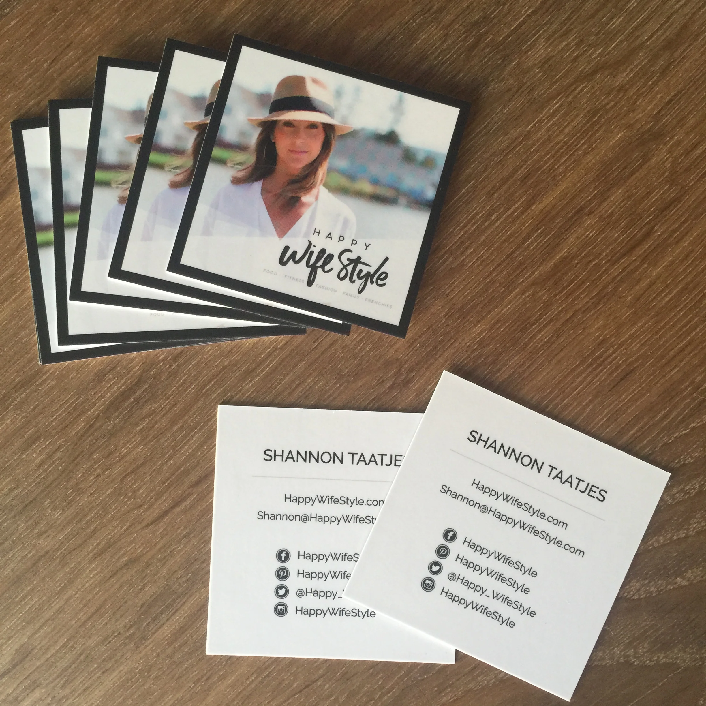
I've recently needed to order more, so I redesigned this new one to include a picture of me, where to find me on social media, and what I'm telling people about all the time...the Whole30! I'm now an official Whole30 Nutrition Partner, I lead large groups through the Whole30 program and tell anyone and everyone about it, so this will make it easier for them to remember it...and me.
People throw away business cards every day. Most end up in the trash. People are less likely to toss a fun, colorful card with photos on it. It peaks their interest. They tend to save them. Most often, someone hands someone a card and it barely gets glanced at and it goes in the pocket or purse...only to get tossed later. Honestly, when I hand out my cards, people do a double take. They look at them, front and back, and front and back again, and usually say "these are SO cute!" I was in Costco recently and met this lovely older couple in the book section while we were both browsing Paleo cookbooks. We struck up a conversation and by the end they wanted to know how to find my blog....so I handed them a few cards. She said that my cards were so great, some of the cutest she'd seen...and they were in the printing business!
I thought this would help fellow bloggers out there to leave a lasting impression! We need to express our creativity and personalities and we CAN do that on a business card! Sometimes that's our first impression, so we might as well make it a great one! :) Even for other professions, if you have the leeway to do so...have fun with your cards! Try a different size, shape, color...and add photos!
So how did I make these? I used Picmonkey.com to design them and ordered them through MOO. Picmonkey is a free site that is amazing for creating all kinds of fun material. It's also what I use to add text to photos that I use in my blog posts and social media (I get that question a lot)....like the text in the top photo. It's user friendly and easy to learn. I designed a front and a back of my card from scratch in the square "design" section, then added a border of white around them for the "bleed area" where they trim it. That ensures none of your design gets trimmed off when they cut the cards. This took a little adjustment my first try...but now I know how much border I need. Once you're in the MOO website...you'll see what I mean. It's pretty cool you can make cards that look like this without hiring a designer! I know they're not perfect, but they display my vision of what my website is all about! That's what's important... what do YOU want to "say" with your cards?
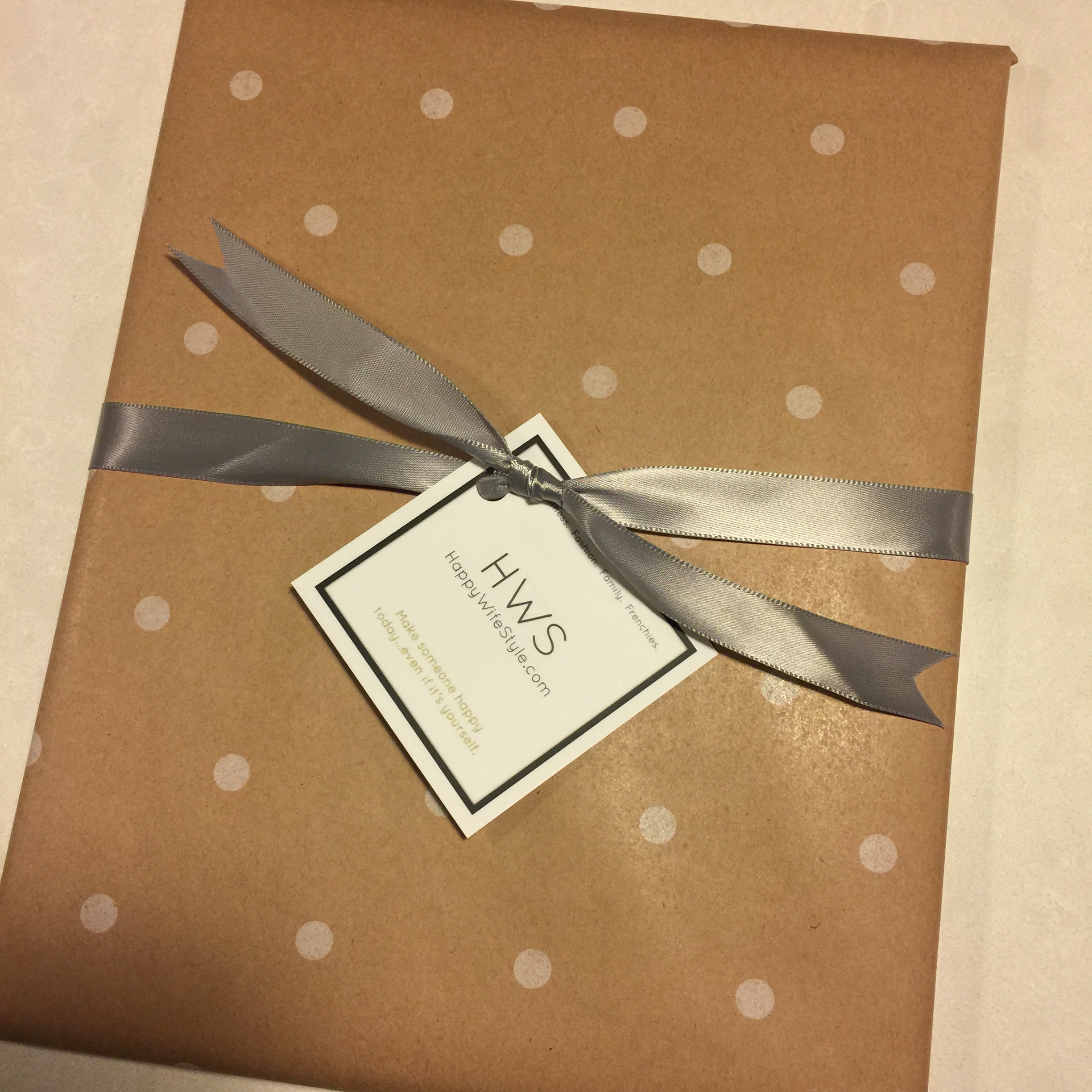
I ordered my cards from MOO.com. They have great templates if you want to start with something more simple. They also have darling "mini" cards! Feeling brave and creative? Design and download your complete design like I did! Have fun with it and get out there and make a FABULOUS first impression! Use this referral link from me and you'll save 10% off your MOO order!!! How cool is that!? I hope this inspires you to learn how to create fun business cards. Enjoy....carry cards you're proud of and you'll hand out a lot more! :) I even put my cute cards on gifts!
UPDATE: Since I wrote this blog post, I won a logo and branding package from Dapper Fox Design by entering a contest put out to Paleo Entrepreneurs! It included business card design so I told her how much I loved the square cards....she designed these and I'm thrilled with them! So, these are my most recent cards!


